
Adding Sections and Questions
- nmonds

- Jan 17, 2022
- 12 min read
Updated: Feb 14, 2022
Creating Headings and Text Content
To start adding structure to a survey, users first have to navigate to the Questions tab on the Survey Details page. This is where any Questions, Headings and Text elements, along with the structure of a Survey, can be added.

To begin adding new items, first right-click on the 'Questions' heading underneath the Questions tab and choose the applicable option. You can add items at a group or individual level.

The options available to users by right-clicking on the 'Questions' heading are as follows:
Element | Purpose |
Section | Sections allow you to group similar fields on a form. Sections allow you to break your form up into different screens, so if you wanted to capture different sets of data on separated screens like a wizard, you could use a Section. |
Layout | Layouts are similar to Sections, they allow you to group similar fields on a form. They do not break up your Survey over separate screens though. Any Questions you place into that Layout will render in a bordered container. This works well when you have different sets of data you are looking to collect on the same Survey screen and you need a way to segregate everything neatly – e.g. Contact Details, Organisation Details, Service Availability Details, Suburbs Service is Delivered etc. |
Question | Questions are the basic building block of any Survey. You can choose all sorts of Questions types (text, number, time, date etc.). |
Question Group | Question Groups are Questions which present matrices of related Question and Answer options. |
Header or Text | This is used to add Headings and Text to your Survey. |
For the purposes of this example, we will start by defining some Headers and the Introduction Text for our survey. To do this, right-click on the 'Questions' heading with the Questions tab and choose 'Add Header or Text'. Then, when the edit screen appears, choose Header 1 to add this style of header to the survey.

The Content box will change depending on what is selected for the Type to give you more control over the presentation of the content. Choose 'Text' and we will add some introduction text to our Survey.

Note: I have chosen to style my text here for the introduction. You will see this a lot through the Survey module. You can either style up the text directly when you create it, or you can utilise the styles defined in your Template to control the look of your survey. If you do not get the option to format the content when creating it, then it is solely governed by the Survey Template. See Using Survey Templates to learn more about using styles. I have left my Survey Template Styles fairly basic, and chosen to style the text here.
Creating Questions
Questions are created via the Questions tab on the Survey Details page. As a user adds questions, the structure of their survey will be presented in the Questions tab as a tree view so they can see the hierarchy and branching as they create their survey.
In order to add a question, right click on the Questions heading at the top of the tree to get started. When a user does this, a drop down list appears in the Questions section, from which they choose 'Add Question'.
Note: You can either add an individual question on its own, or add Question Groups/ Sections first and then add questions. These questions groups/sections/questions will be presented in a hierarchical structure in the tree view beneath the Questions heading.

You will then be presented with the following screen:

Stepping through the Create Question screen, various decisions can be made about the Question look and feel; types of questions; if they are to default information from ChilliDB; if they have a merge strategy in place, and so on. Let's look at the features on this screen one-by-one:
Question Text is where users can customise the questions in their Survey. This field uses a rich text editor, and when the mouse is hovered over it, a menu with options such as bold; a colour palette and so on, will appear so users can customise the question text.
Question Suffix – can be used to include a comment related to that question. For example, “Service Name may not be the same as Legal Trading Name”.
Question Help – is used to provide helpful content to a user. For example, to explain something in more detail. This option produces a help icon on the survey next to the question it relates to, which will only be visible when users hover their mouse over the icon.

Internal Labels - if users want to use reporting tools such as Crystal Reports to generate reports for their surveys, then they should use internal labels to give each question a succinct, logical and short name, which can then easily be identified in reporting views and used in Crystal Reports. The reporting views for a survey allow users to easily work with the survey, and they are generated when a survey is published. The Survey Name and Section Name will help you identify the reporting views related to a survey.

Default From Fields - This is one the most powerful features of ChilliDB Survey. If users want to default information from within ChilliDB into the Survey itself, they can do so from either Contact or Organisation levels of ChilliDB, and nearly all types of fields in ChilliDB can default information into your Survey.

In our example, we will default the question Your Service Name to the Organisation Name in ChilliDB, so when a Survey Responder looks at the survey, their Organisation Name will be pre-filled.

Response Type - When a question is defaulted to draw information from ChilliDB fields, which is being done in this example, then the rest of the question specifics are locked down. If the field in ChilliDB is a Text field, then ChilliDB survey will not let a user change the Response Type (the field / data type for your Question) to something like a Date, as that would not make sense and could create data quality issues. ChilliDB will take care of this for you. ChilliDB will also set properties such as Minimum Number of Characters, and Maximum Number of Characters along with Response Required. In the example, we can see this has been done to align with the fields in ChilliDB and to again enforce data quality to information being entered into ChilliDB.


While most of the response types above are logical, some are special, for example:
File – allows users to attach one or more files in their survey response
Live System Data – sometimes users might want to have the survey link an existing contact or organisation in ChilliDB, rather than using plain text fields to enter a name. This option will allow the survey responder to perform a search to find a Contact or Organisation within ChilliDB.
When users choose one of these options, they will be asked to choose a Data Source, similar to when creating Custom Fields.

Formula – Users can construct a formula to calculate something based on information supplied by the Survey Responder, and the Formula field will present the information in the Survey – an example may be a score for something, or a GST calculation.

Auto Merge On Submission – Allows users to decide on a merge strategy for each question, which has been defaulted from ChilliDB information. They can decide if the question is merged back into the ChilliDB field automatically when the Survey Responder submits their survey, or if they would prefer to review the survey response and choose to merge it manually. Automatic merge only occurs when the survey response is submitted and not when it is simply saved. Auto Merge is a separate license, so if you do not have this license, you will not see the option in your ChilliDB. To obtain the license, contact the ChilliDB HelpDesk via helpdesk@chillidb.com

Response Required – This controls whether or not the question is mandatory for the survey responder.
Display Annotation Field – This allows users to capture additional related information in an Annotation field, which will be displayed to the respondent as part of the question. For example, the question could be “If you answered 'No', then please explain further”, and the Annotation field could be used to capture that explanation. This option can be set if this question is a required field, or if the question needs a mechanism for recording an additional “Annotation” text or even for uploading a file.
Read Only – This field is useful when defaulting information from ChilliDB in situations where you would like to just display the value and not allow the survey responder to change it. An example of this might be the Service Name. Read Only Questions are also useful for Visibility Filters, Cross Validation, and sources of data for Formula fields.
Visible – This allows users to bring information into the Survey through Defaulting - for use in Visibility Filters, Cross Validation, and sources of data for Formula fields, but not have it shown to the Survey Responder on the Survey.

Answer Field Position – Allows users to set the position of the answer field in relation to the question text.

Once users have completed a question and decided on the relevant options, they can either create another question immediately after this one by selecting 'Next Question', or they can simply save the current question and return to the Survey Overview screen by selecting the 'Finish' button.
Creating Question Groups
Sometimes users may wish to ask several questions which share a common set of choice values. In this case, rather than creating each single question with a choice response type, they can create a single Question Group item for this type of questions.
For example, they might be looking to capture something like this:

In order to create a Question Group item, users will need to select 'Add Question Group' from the drop-down list that appears when they right click in the Question tab. They will be presented with the following screen:
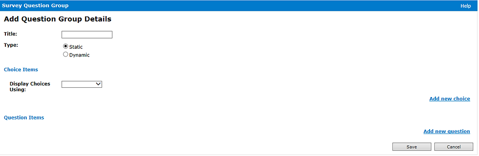
The detail which needs to be added to create the Question Group item is:
1. Add text in the Title to define the question.
2. Select the Type, ChilliDB will default to 'Static' answers. If users choose 'Dynamic', this is like using “Default From” on simple questions. They don’t get to choose any other options, as below:

The subsequent items in this section of the document only apply to Static Question Groups. You can add a static question group, and then each question in that question group can Default to something else.
3. Users can select the choice values for their answer within the Choice Items section. With these choice values, you can add new choice; edit or delete existing choices; and arrange choice order.

4. Users can add a set of questions which make use of the choice values defined above as the answer type. With these question items, you can add a new question, edit or delete existing questions, assign a default value for each question according to the choice values defined above, and arrange the question order.

5.Once users have completed building their Question Group item, they click the 'Save' button to save the current item, and they are then returned to the Survey Display screen.
When a question or question group item has been added to the survey, the Questions: Section will be displayed in a similar way to the example below:

Please note as many Question and Question Group items as needed can be added to a survey. In addition to questions, there are other features that can be used to set the display/ print layout of a survey:
Dynamic Question Groups - This option allows users to default Custom Field Grid Layouts into a survey. This means they can capture many “child” records for their Custom Field Grid Layout through their surveys. When defaulting to fields in ChilliDB, most things that can be changed are locked down to protect data quality.

Creating Layouts to Hold Related Questions
Users can place one or more Questions or Question Group items into rows and columns; group them with a border; show grid lines, or a combination of these, by selecting 'Add Layout Item' from the drop down list in the Questions section. When doing so, they will be presented with the following screen:

On this screen, users can choose if they would like to have vertical or horizontal grid lines within the layout; set a colour for the grid lines; choose the thickness of the grid lines; and how many columns per row do they want to have within the layout. “Fieldset” is another important item - this is what draws the box around the collection of Questions in the Layout to make it look nice.
Once users have completed the settings in their Layout Item, they click the 'Save' button to save the current item and return to the Survey Display screen.
The Layout Item section also provides the ability to add feature items, such as a question, into this section. This is done either by using the cursor to drag the chosen question into the layout section; or questions can be added to the layout section by right-clicking on the Layout Item and then selecting Add Question/or Add Question Group from the drop down list. In order to insert a question/ question group item, the same process is followed as when creating a Question/ Question Group item for the survey.
Users can also create this layout recursively, which means they can create a layout within a layout. There is no limit on how many recursive depths are used within this layout item.
Re-Sequencing Survey Elements
Once users have added a number of Questions, Layouts, Sections etcetera, they can easily re-sequence their survey by dragging these items up and down in the Tree View to restructure the survey. Some items may also be dragged underneath other items to create the nesting of items, where ChilliDB supports this option.
Not all elements can be nested, and ChilliDB will guide users when they try to do this.
Visibility Filters
Visibility Filters are available for sections and layouts (from 3.2 onwards). When creating or maintaining a section or layout, users may define one or more visibility filters, which control the visibility of all questions within the relevant sections or layouts. This is a useful tool for conditionally showing only part of a survey and having conditions based on information either entered by the survey responder, or based on information a user has defaulted into the survey itself.
An example of where this would be used is if a user has a collection of questions which are defaulting information from within ChilliDB for organisations. These organisations have Custom Fields Sections which are relevant to certain types of organisation. For example, a Custom Fields Section called 'General Practice Details', which would be collected for organisations of the type 'General Practice'. A visibility filter would allow users to only collect information from those survey responders who are from organisations of this type for that part of the survey.
To achieve this, users add Visibility Filters to their survey somewhere above the section that they would like to conditionally hide. Before doing this, they need to bring the Organisation Type into their survey by defaulting it into a question so it is accessible to both the survey and the filters. Typically, we don’t want the Organisation Type to be modified through the Survey, or even shown to the Survey Responders, so we would:
1) Create a question called 'Organisation Type' and default the information from the organisation module’s 'Type' field.
2) We would make the field 'Read Only' = Yes, and the field 'Visible = No'

Once users have entered the information needed to configure a Visibility Filter, they can edit out a section, or create one if they don’t have one already. In this example, there is a Section called 'General Practice Organisations'. If a user only wanted this survey section visible when the organisation filling in the survey is a general practice, they should click the 'Add New Filter' link to create a filter and set the question field they are basing the test on to 'Organisation Type'. Then, set the operator to 'Is Equal'. Next, set the value to 'General Practice'. This will mean that if the organisation has a type of 'General Practice', this section of the survey will be visible.

In other words, when the conditions of the Visibility Filter result in a TRUE test result, then the filter is active. If users have no filters, then the section of the survey is always visible.
Using the operators, the conditionality tests can be mixed and matched to be fit for purpose. If additional filters are added, a choice can be made as to how each test relates to the other tests, with the ability to AND / OR the tests.
Cross Validation
Cross Validation allows users to add business rules to their survey to enforce conditions which are based on information in their survey. When the conditions fail their test, then a message, which users can specify, is displayed to the respondent. The choice can be made whether the validation rule is a warning raised for the respondent, which they then simply acknowledge before submitting their survey response; or if the condition prevents them from submitting their survey response until the issue is corrected.
An example of where this would be used is if invoices were being collected for services delivered over a quarter, and the organisation providing the service must have current accreditation for them to submit their invoice. A check of the accreditation date, which would be held in ChilliDB, could determine if the invoice submission was accepted or not or, alternatively, force them to upload their new Accreditation certificate along with their invoice.
This is achieved by adding Cross Validation Rules based on the Accreditation date, which would be a question with a default set to draw in information from the organisation record. This is exactly the same approach as the example of using the Organisation Type in Visibility Filters above.
Once the Accreditation date is available in a survey, users can create a Cross Validation message and rules. First, click on 'Actions' from the drop-down menu while on the Survey Details page.


Then, fill in the required fields on the 'Survey Cross Validation Maintenance' page. The fields are as follows:
Purpose: is a simple description of the reason for cross validation.
Message: which can be HTML formatted, is the message presented to the user when the conditions are not met.
Cross Validation Message Location: the section of the survey where a message will be shown if conditions are not met. This flexibility allows users to prevent a respondent from leaving a part of the survey until they correct the issue.
How this rule will be used: gives users the flexibility of having their cross validation present a warning for acknowledgment, allowing the survey respondent to accept the warning and continue without fixing it, or enforcing the rule conditions, meaning the respondent cannot progress any further without correcting the issue.
Once this information has been entered, users click on 'Save' to save their cross validation.
Now that the cross validation message and configuration have been created, users can specify one or more conditions. In this example, we will create a condition which checks our survey question regarding the Accreditation date and check that it is less than the closing date for our quarter. The result will be if the organisation is not accredited for the entirety of the quarter, then they will be asked to attach their new accreditation certificate along with their invoice. Once these conditions have been created, click 'Save' .

Using the Operators, users can mix and match the conditionality tests to suit their purposes. If they add additional filters, they can then also choose how each condition relates to the other conditions they have created, with the ability to AND / OR each condition. They can have conditions which compare against constant values, or they could design complex surveys which check questions against questions.


Comments